Kaplan Test Prep
Project background
Re-introducing an 80-year-old brand
Category
UX/UI, Web
Since 1938, Kaplan Test Prep has helped millions of students navigate the college entrance process and beyond. Kaplan was a ubiquitous brand during the 80s and 90s. You’d see them in newspapers, magazines, and on the television and radio. You would even find them in the streets of most major cities nationwide in the form of their brick and mortar testing centers. The 2010s brought with it a shift to an all-digital strategy. No longer would students have to take classes in those physical storefronts – this could now be done via virtual classrooms. All traditional print and media advertising would move online and through paid media services. The result of this fundamental shift in Kaplan’s business model was an urgent need to re-evaluate its marketing platform, kaptest.com.
Main challenges
6 key areas we identified
One of the first steps was to identify where the current website user experience shined, and where it didn’t, to create a baseline from which we could expand.
How we did it
- In-depth user interviews
- In-depth internal stakeholder interviews
- Focus groups with existing and potential customers
- Audit of all digital properties, products, and collateral
- Competitive analysis
1
Non-intuitive and inconsistent visual design system
2
Confusing product nomenclature and offerings
3
Difficult purchase processes and systems
4
Incoherent site navigational structures
5
Lacking a cohesive content and brand strategy
6
Inadequate technology infrastructure
Digging deeper
The journey is the reward
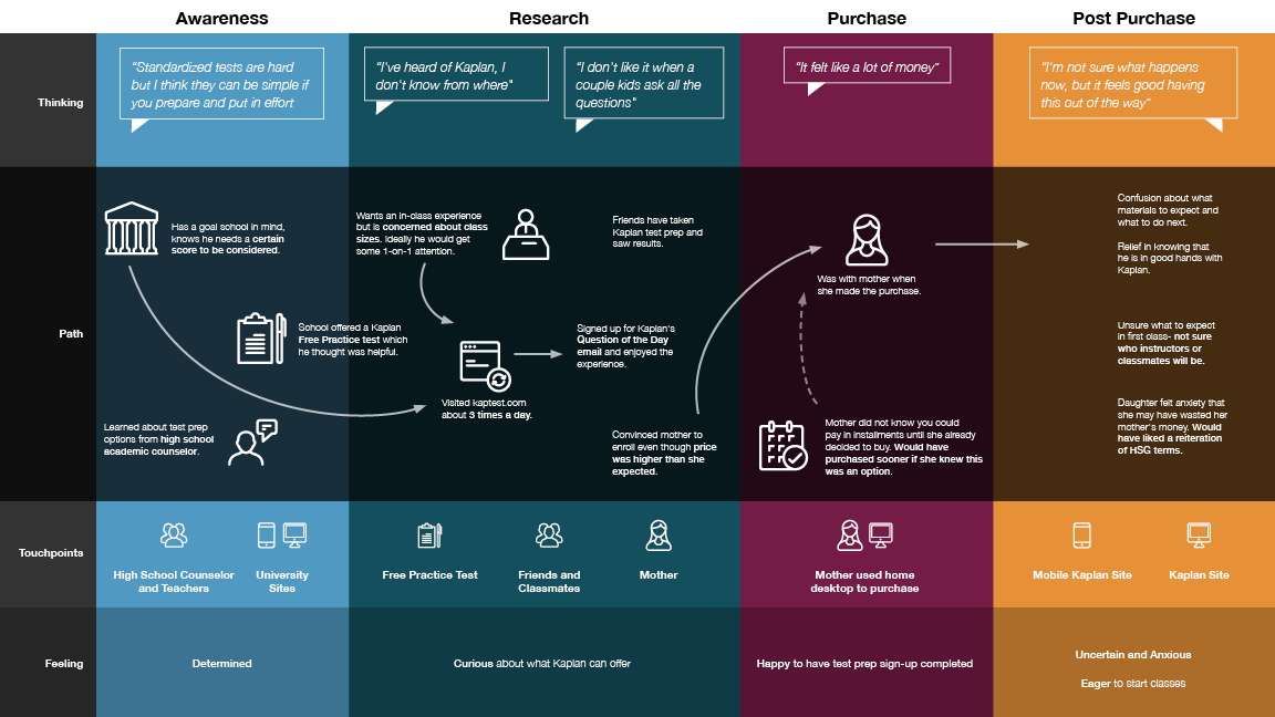
Once we understood the pitfalls, we dove deeper into the user’s journey across sites and products to better understand their needs.
How we did it
- Usability testing
- User personas & journey mapping
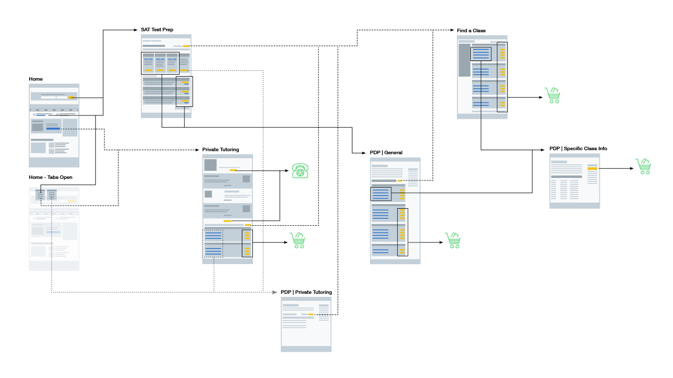
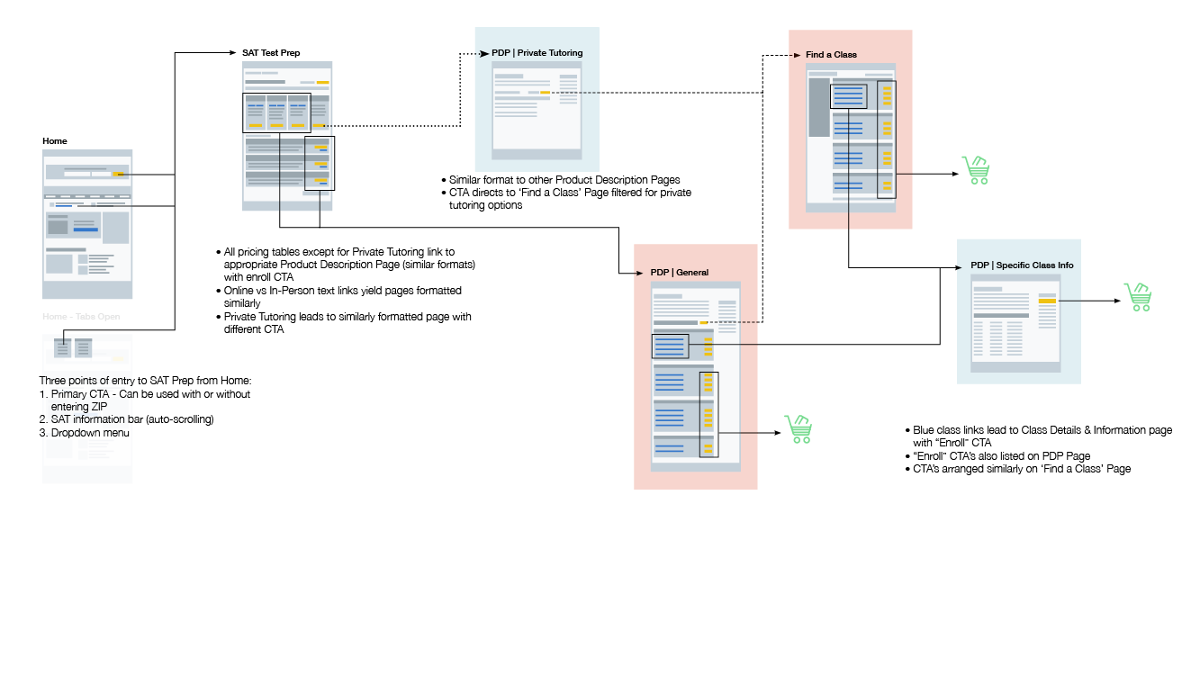
- Sitemapping & user flow creation
- Live website user intercepts
- Built out a content strategy
- Product nomenclature research
That Kaplan look
From pencils to pixels
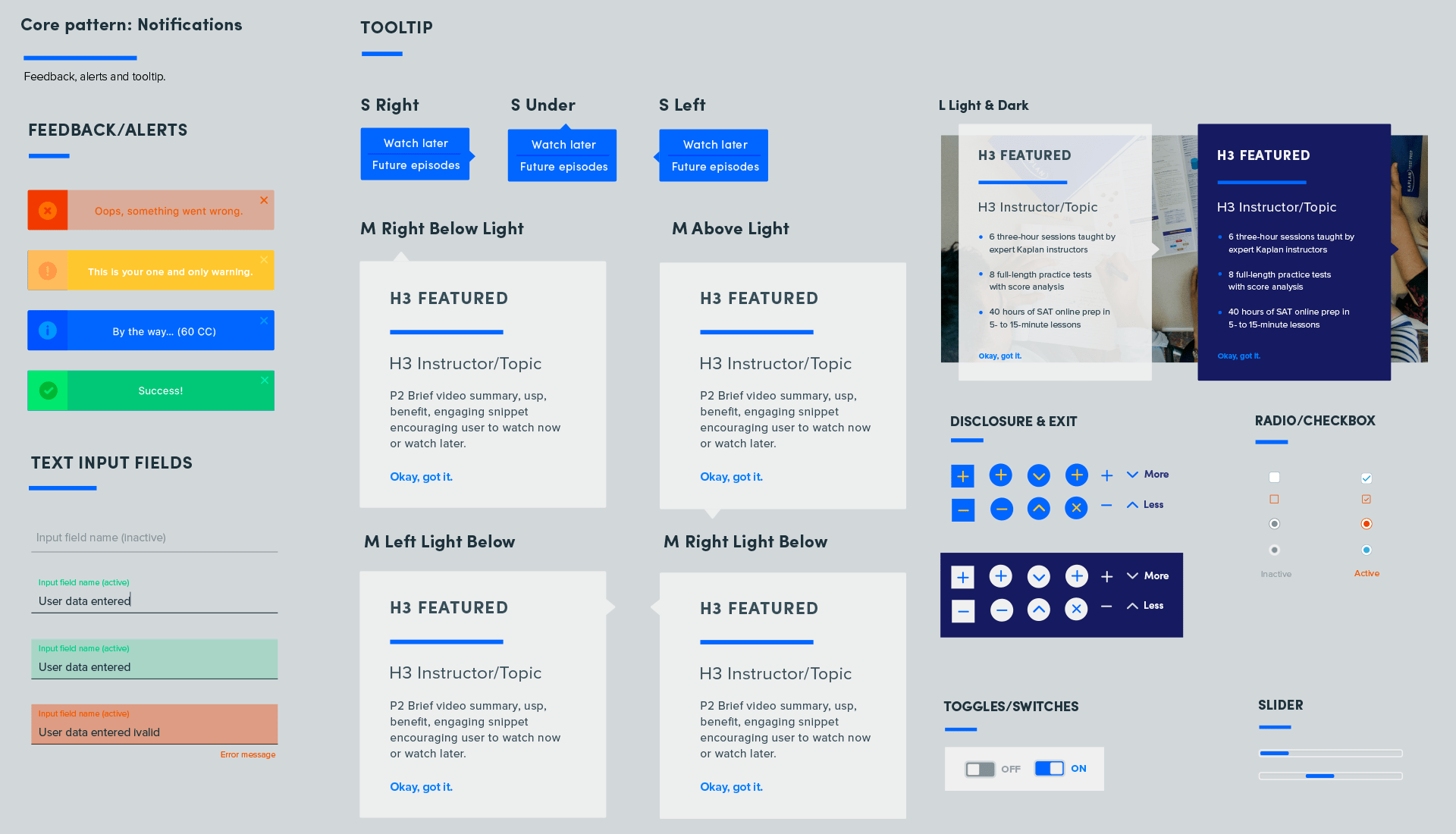
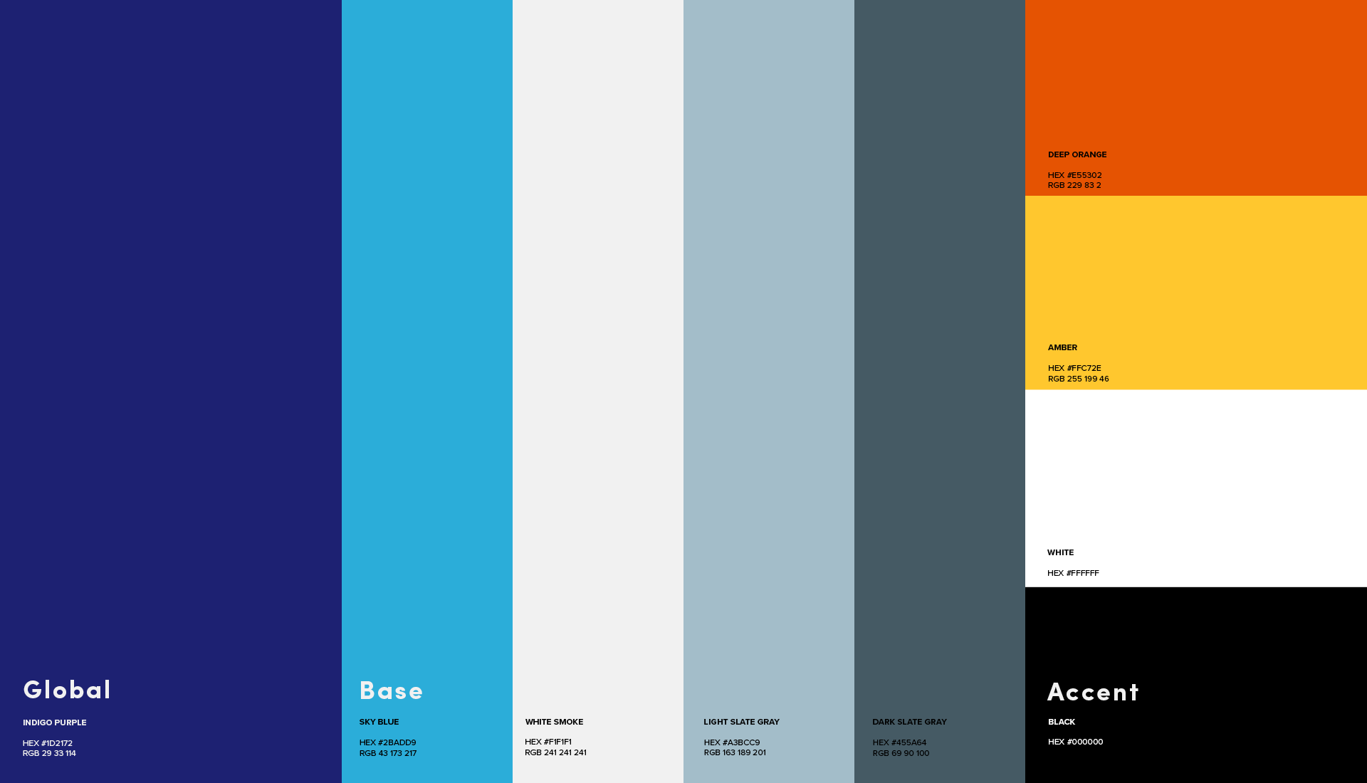
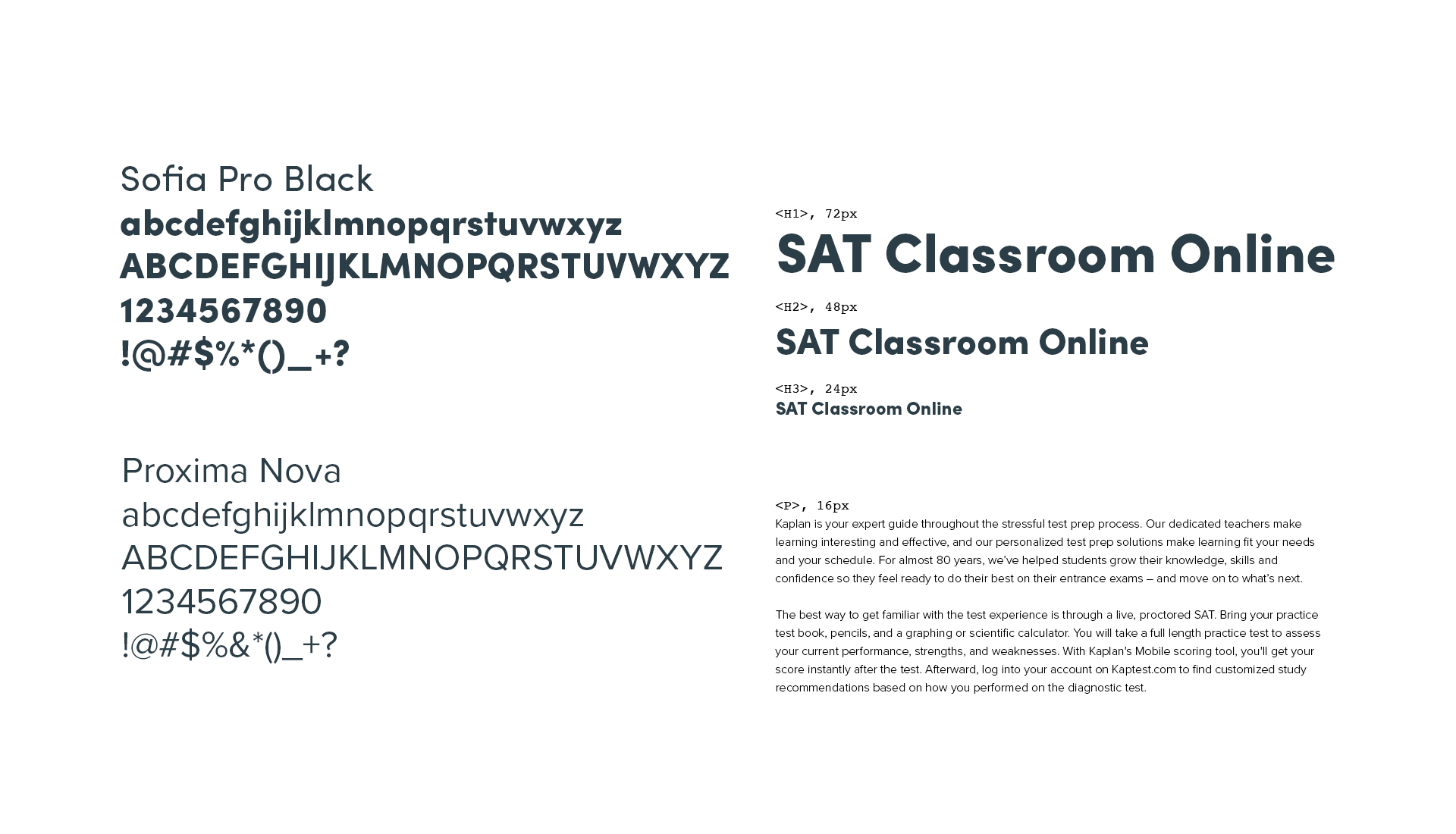
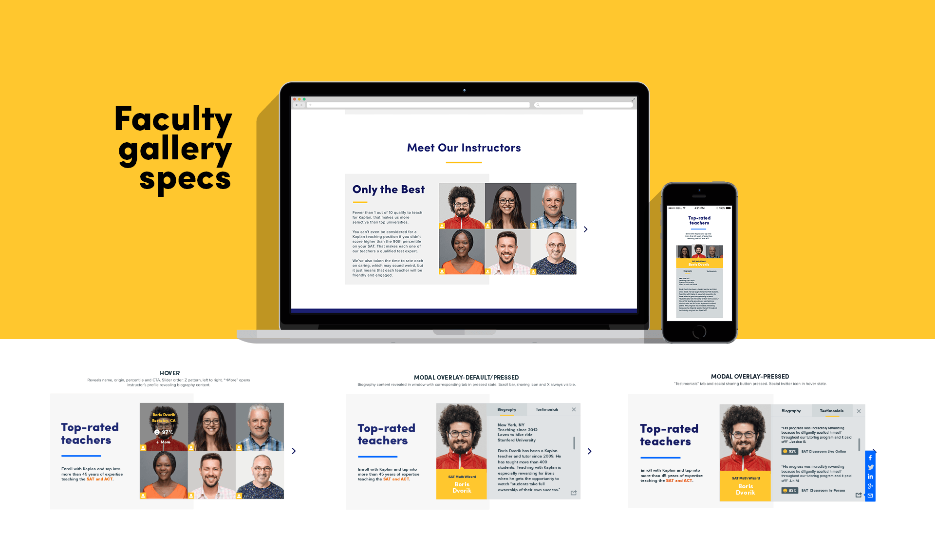
I leaned heavily on design principles rooted in simplicity and modularity. This led us to design and develop the visual language and systems in a small-to-large (basic to complex) approach. All UI elements and iconography were custom created – typography and color palettes were also simplified. The flexible and scalable qualities of the design also drove the numerous nuances across products and customer bases to shine through.
Special attention was placed on making sure the user experience remained consistently positive and rewarding throughout the purchase path.
How we did it
- Brainstorming & mood boarding session
- Sketching & wireframing
- Prototyping (interactive/static)
- Modular visual design
- Design specification documents
- Usability testing & validation
Side-by-side comparison
Wellness, streamlined
This illustrates the differences in user experience using the insights we gleaned. Our new online strategy now places the needs of students and parents at its core. This new focus also arranges the most salient information in an easy-to-access format.

The new website
Now with more UX
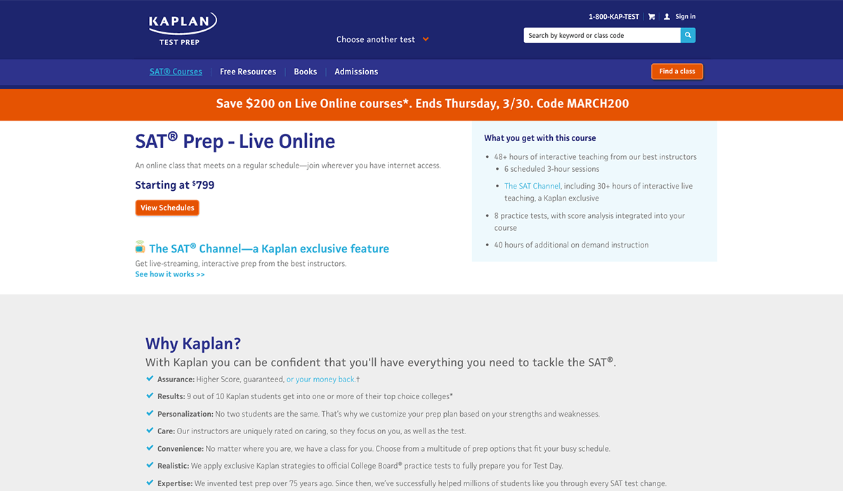
The new Kaptest.com is a truer expression of the Kaplan brand and a modernized, dynamic resource for students and parents.
What's new
- Consistent & positive user experience – from product discovery through purchase
- Simpler, more intuitive, & fully responsive interface
- Streamlined product offerings and relevant nomenclature
- Unified brand expression showcasing all Kaplan products


